Label of the Month - January 2026
Share
This month’s label is a reminder that packaging doesn’t need to shout to stand out. HotDrop lets shape, texture and confident simplicity do the talking. It’s a great example of how the right label can stop shoppers in their tracks, signal quality instantly and influence perception before the product is even picked up - and that’s exactly what we explore in this month’s feature.

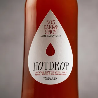
Turning the Brand Name into the Label Itself
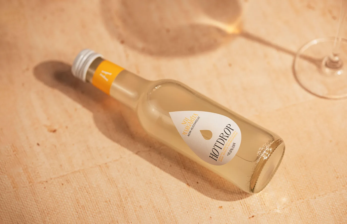
This bold non-alcoholic cocktail range needed packaging that felt confident, premium and full of personality from the first glance. The solution was a die-cut droplet label that turns the brand name into a physical feature of the pack. Rather than printing a droplet graphic, the label itself becomes the shape. It’s simple, memorable and impossible to miss on shelf - exactly what strong can label printing should achieve.
The label was produced on Tintoretto Gesso, a premium uncoated material known for its subtle texture and tactile feel. A flood High Rub Matt varnish protects the surface and keeps the finish looking sharp through transport, chilling and handling. The colour palette stays clean and punchy, allowing the shape and texture to do the heavy lifting.
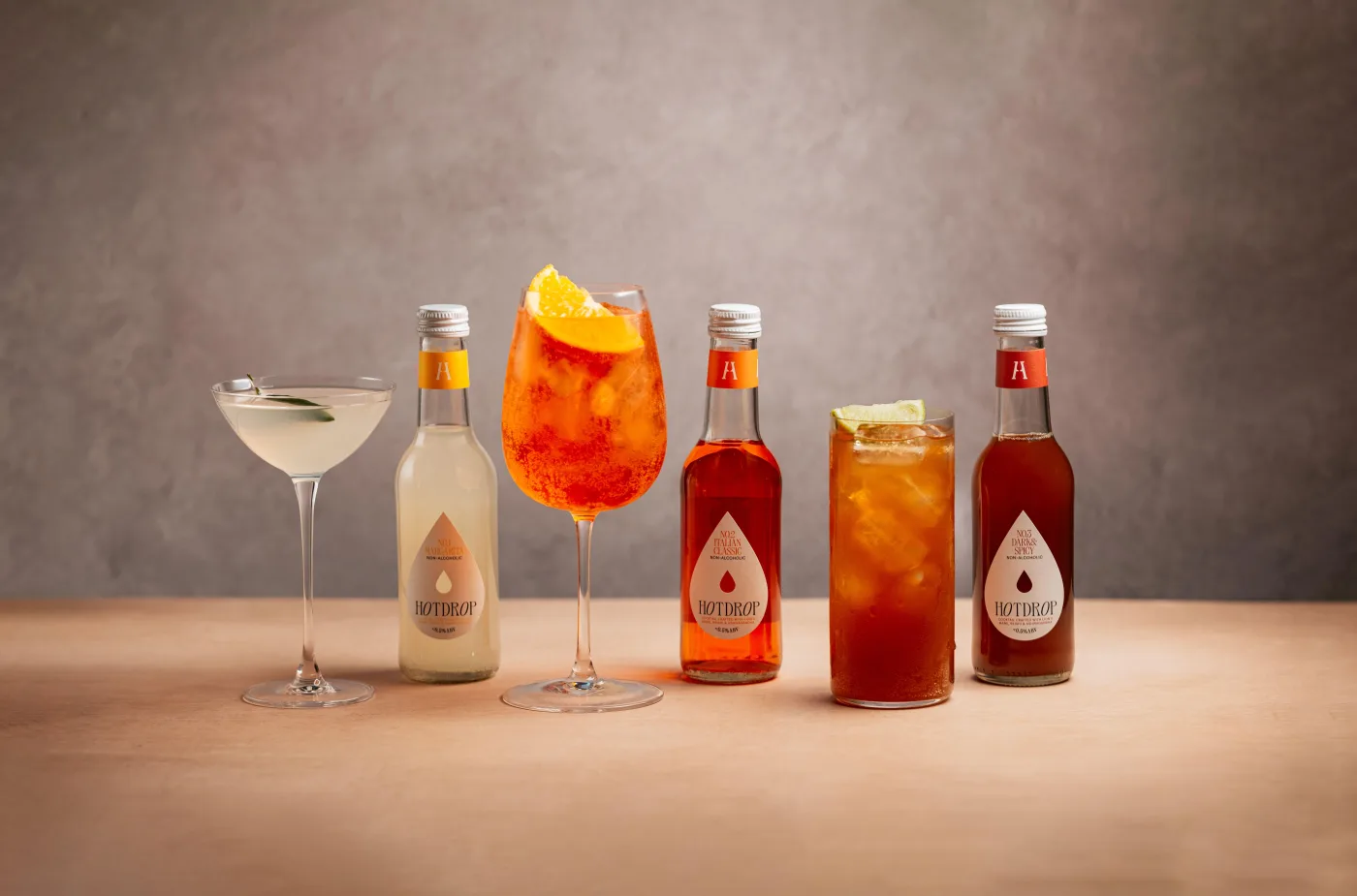
When Shape Becomes Part of the Brand
What makes this project stand out is how structure and material work together. The custom cutter creates instant recognition, while the textured stock reinforces the craft and quality cues consumers expect from modern alcohol-free drinks. For brands considering premium die-cut can labels for beverage packaging, this is a great reminder that impact doesn’t always come from complex graphics. Sometimes the most powerful move is turning your brand into a physical object. When shape, texture and print finish align, the label becomes part of the product experience - and that’s where real shelf presence begins.
To explore how shaped labels and premium materials could elevate your next drinks launch, get in touch with our team and start the conversation.