Label of the Month-August 2026: Whisky Label Printing with Hot Foil and High-Build Screen
Share
For this month’s Label of the Month, we’re looking at Highland Nectar from Elixir Distillers. With roots going back to the Victorian era, the brand has been reworked as a modern Scotch whisky liqueur while keeping a clear connection to its Highland heritage.
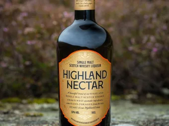
For this whisky label printing, the focus was on keeping the botanical detail clean and giving the central name and shaped border enough presence against the dark glass.
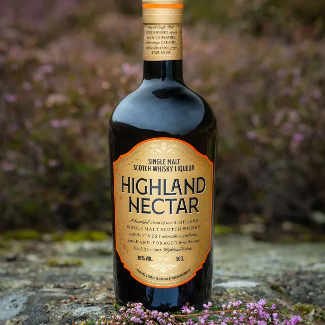
How does this whisky label reflect Highland Nectar?
This whisky label, designed by Elixir’s in-house team, carries that balance through visually: traditional Highland references, detailed botanical artwork and a bold central product name, all wrapped into a shaped design that sits naturally on the dark bottle.
Botanical artwork and the thistle motif bring in the Highland reference without making the design feel overly traditional. It keeps the heritage visible, but the overall look still feels current.
What materials and finishes were used for this whisky label?
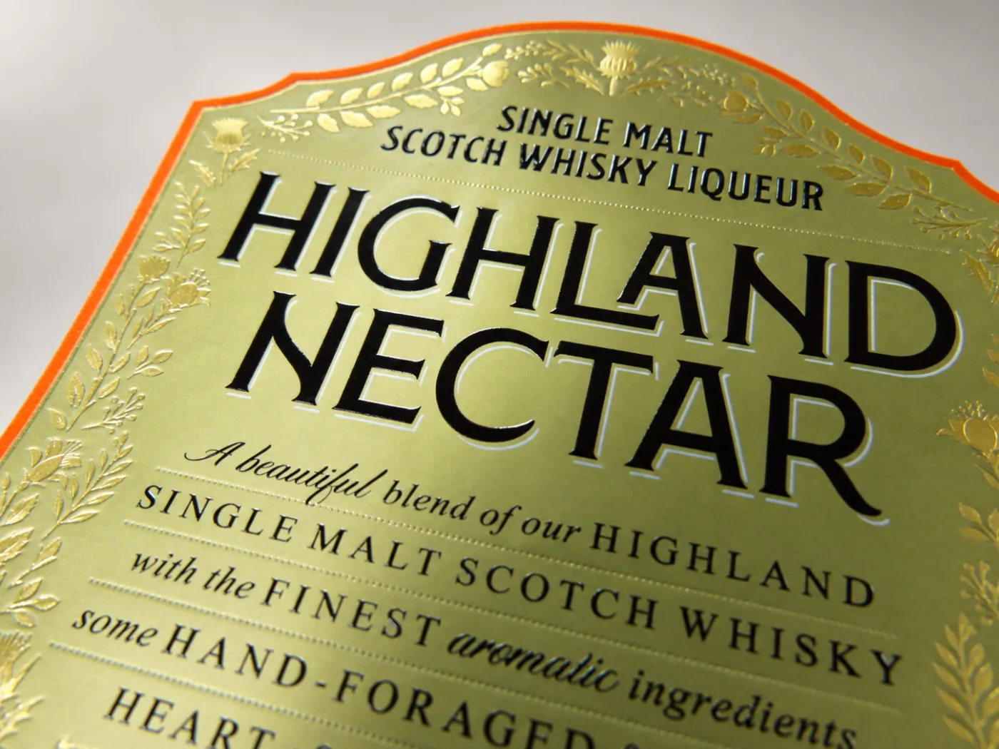
The label was printed on Matt Wine Classic with a permanent adhesive and finished with a scuff-resistant ultra-matt varnish. This gives the label a softer, low-shine surface, helps keep the black text crisp against the gold background and adds extra protection during handling.
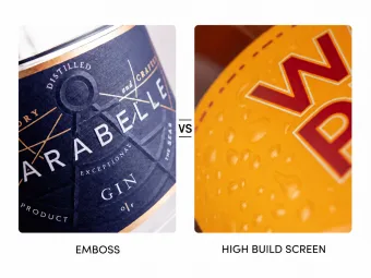
The main product name was finished with high-build screen, adding a raised texture you can feel, while hot foil was used on the finer botanical details to introduce contrast and catch the light without making the whole label reflective.
Why do the high-build screen and hot foil work well together?
The high-build screen adds weight and texture to the Highland Nectar name, while the hot foil is kept to the finer illustrated details where a lighter metallic effect works better.
That difference helps the eye move naturally between the main product name and the surrounding artwork. Against the ultra-matt surface, each finish behaves differently under the light, while the orange edge keeps the shaped label clearly defined against the dark glass.
Planning your next whisky bottle label?
At Label Apeel, we specialise in decorative finishes that help carry your brand story through the label - whether that’s through foil, embossing, high-build screen or a combination of finishes. The aim is to use those processes where they add something to the design, helping key details, textures and visual cues come through properly on the finished bottle.
Have a whisky label project coming up? Get in touch and we’ll help you work through the print details.