CMYK vs RGB: Why Printed Labels Look Different from Your Screen?
Share
You’ve spent hours getting the colour just right on screen. The artwork looks perfect, the client loves it and everything is ready to go.
Then you see it printed and the colour looks slightly… off.
This does not necessarily mean anything has gone wrong. The colours on screens and print are created in completely different ways, so an exact visual match is not always possible.
Understanding RGB and CMYK, along with Pantone colours, proofing, lighting and label materials, can help you design with print in mind and avoid surprises.
RGB vs CMYK: What’s the Difference?
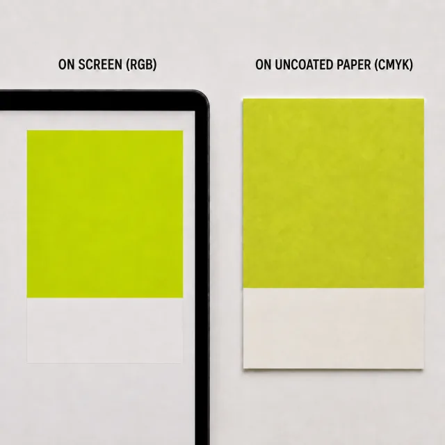
The biggest difference is simple: screens create colour with light, while printing creates colour with ink.
RGB stands for Red, Green and Blue and is used by digital screens such as laptops, phones and monitors.
Because RGB uses light, it can produce particularly bright and vibrant colours. Certain vivid blues, greens and fluorescent-looking shades can look great on screen but cannot always be reproduced closely in standard CMYK printing.
CMYK stands for Cyan, Magenta, Yellow and Key (Black). These four inks are combined to reproduce a wide range of printed colours.
However, CMYK has a smaller colour range than RGB. When RGB artwork is converted to CMYK, some colours need to be adjusted to their closest printable CMYK equivalent.
That is why an electric blue on your monitor might look more muted once printed.
Where Do Pantone Colours Come In?
Sometimes a brand colour needs greater consistency than standard CMYK reproduction can provide.
The Pantone Matching System provides standardised colour references that help designers, printers and brands communicate specific colours more accurately.
Where the job and print process allow, a Pantone colour can be produced using a specially mixed single ink rather than a combination of CMYK inks. This can be particularly useful for important brand colours or shades that are difficult to reproduce accurately in CMYK.
However, Pantone colours are not a guarantee that a colour will look identical in every situation. The material, ink, print process, white underprint and finishing techniques can all influence the final appearance.
Why Print Proofing Matters?
A proof gives you an opportunity to check your artwork before your final labels go into production.
A digital proof or PDF viewed on screen is useful for checking artwork positioning, text, cut lines or die-lines and general layout. But because you are still viewing it on a screen, it should not be treated as an exact representation of printed colour.
Where colour accuracy is particularly important, a physical colour proof, press proof or printed sample can give you a better indication of the finished result.
If a brand colour is critical, discuss it with your printer early in the project.
Your Lighting Changes Colour Too
The light you view a label under can also affect how its colour appears.
The same label can look subtly different in daylight, office lighting, warm household lighting or under cool LEDs.
Your monitor settings matter too. Screen brightness and colour settings can affect how artwork appears, and an uncalibrated monitor should not be relied on as a final colour reference.
The Label Material and Finish Matter
The material underneath the print can also influence the finished colour.
Printing the same colour onto a bright white material, textured paper, clear label or metallic substrate can produce noticeably different results. On clear, metallic or coloured materials, an opaque white underprint may also be needed to help colours appear as intended.
Pantone also provides separate colour references for coated and uncoated stocks, recognising that the same ink colour can appear different depending on the material it is printed onto. This is why a Pantone colour specified for a coated stock may not look exactly the same when printed on an uncoated material.
Finishes such as gloss laminate or matt varnish can change how light reflects from the label and therefore how the colour is perceived.
These materials and finishes are part of what gives a label its character - they just need to be considered when choosing and approving colours.
Request a Portfolio
Complete the form and we'll send you a portfolio of some of our best work.
How to Get More Predictable Label Colour?
The best approach is not to expect your printed label to perfectly imitate your laptop screen. Instead, design for the medium it will ultimately appear on.
- Follow your printer’s label artwork guidelines and recommended colour profile.
- Flag critical brand colours early.
- Use Pantone references or spot colours where appropriate and supported by the print process.
- Consider the label material and whether white ink is needed underneath the design.
- Request a physical proof or representative printed sample where colour is critical.
- Assess colour in appropriate lighting rather than relying on an uncalibrated screen alone.
Let’s Get Your Colour Right
If you’re unsure how a colour will translate from screen to print, this is where we can help.
Speak to our team about your project. Our studio team can guide you on colour, artwork and proofing before your labels reach production.
Request a Quote
Tell us a little about your label requirements and our team will prepare a tailored quote. If we need any extra information, we’ll be in touch before sending it over.
Contact Us
Need advice on your next label project, a technical challenge, or simply want to explore what's possible? Get in touch with our team and we’ll help you find the right solution for your product, budget and timescales.