Label of the Month-June 2026: A personalised whisky label that carries story and art
Share
The first thing Crǣft does is refuse to blend in.
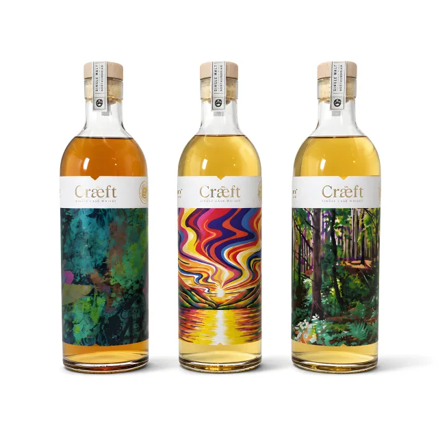
This personalised whisky label series is shaped by a strong sense of Northumbrian identity, but it doesn’t lean on traditional heritage imagery. Instead, that connection to place is expressed in a more contemporary, instinctive way: three single casks, three artistic interpretations, and three whisky bottle labels that don’t try to match each other yet still feel unmistakably part of the same Northumbrian story.
The name Crǣft comes from the Old English for ‘art’ or ‘skill’, which feels particularly fitting for a collection built around creativity and craftsmanship. More than an experimental whisky release, it marks Ad Gefrin’s first Northumbrian English single malt in modern times, presented as three single casks with distinct flavour profiles and paired artworks, each given its own space on the label to tell its story.
Materials and finishes for a craft‑led whisky label
Beneath the artwork and storytelling, this is a deliberately detail‑driven whisky label printing approach.
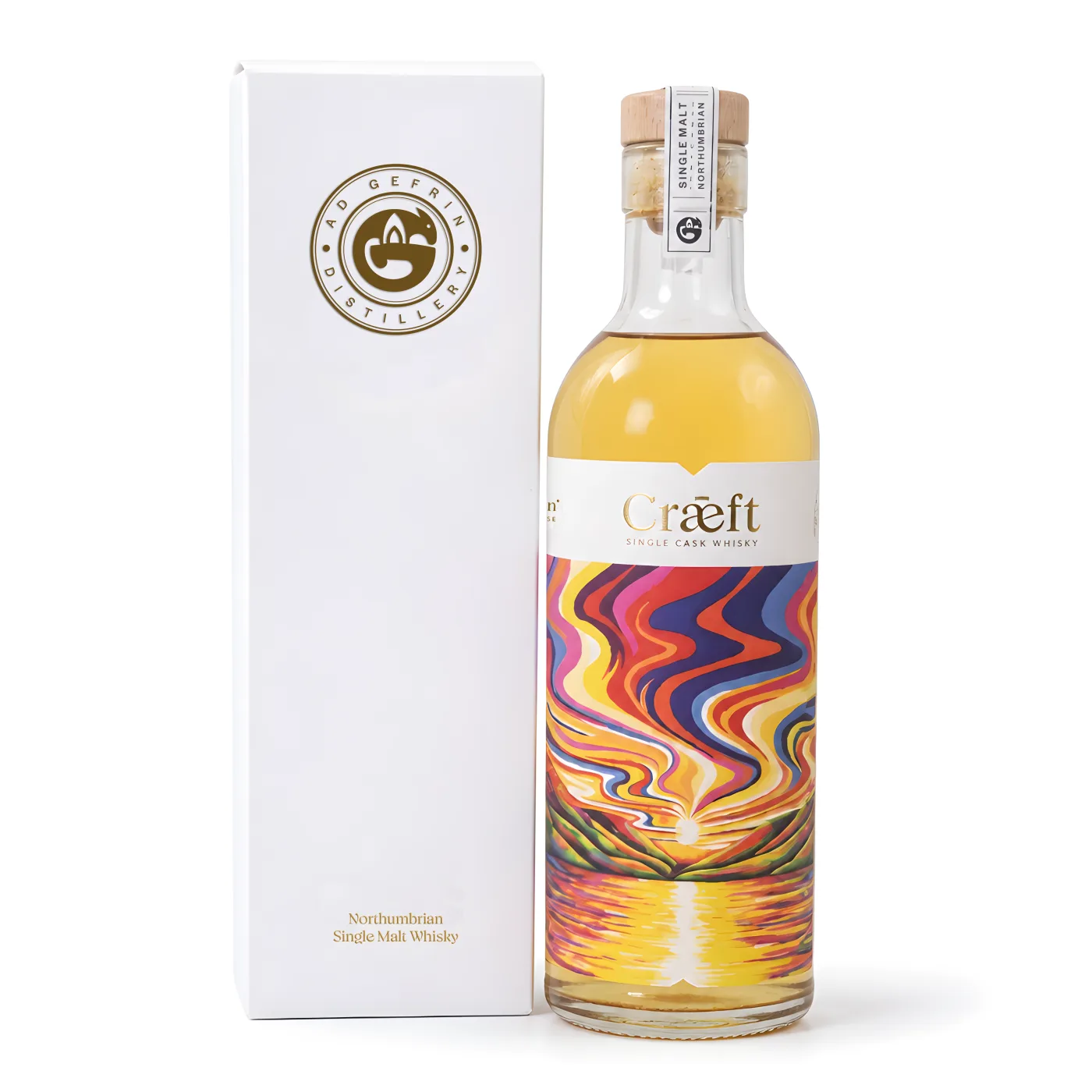
- Tintoretto Gesso uncoated stock, supplied on a glassine liner, gives the label a lightly textured, almost canvas-like surface that suits the artist collaboration concept.
- Hot Foil is used selectively for the logo and key typography, adding a refined metallic accent rather than overpowering the art.
- Embossing provides a tactile hierarchy – the Crǣft name and Ad Gefrin logo have physical presence when the bottle is handled.
- A high rub matt varnish keeps glare down while preserving the natural feel of the paper, so the label looks and feels considered when the bottle is unboxed.
- The artwork was produced using four-colour digital print on HP Indigo with one additional Pantone colour, before being finished on the Digicon.
The uncoated, matt‑finished surface helps the label hold onto its sense of craft and heritage, while hot foil and emboss deliver the premium cues you expect from a personalised whisky label without shouting.
Together, these decisions feel right for a limited release single malt that’s meant to be discovered, savoured and remembered.
Final thoughts
The Crǣft Series shows what happens when the label is treated as part of the story rather than simply the place where that story is explained.
Three casks have been given three individual visual identities, but the thoughtful use of material, foil, embossing and matt varnish gives them a shared language. The artwork creates curiosity; the print gives it texture, light and presence on the bottle.
It is a compelling example of how a carefully produced whisky bottle label can bring together spirit, place and creative expression - and turn each release into something to be seen, held and enjoyed.
If this has sparked ideas for your own whisky or spirits label project, get in touch to discuss your requirements, or order our portfolio to explore our papers, foils and embellishments more closely.
Order a Portfolio
Complete the form and we'll send you a portfolio of some of our best work.